Archive for the ‘Uncategorized’ Category

Sans Serif Update

May 17, 2010

Since declaring that it would be impossible for me to create a grotesque sans serif based on my serif designs (because of the contrasting strokes) I have actually found some examples of grotesque and serif faces working together in harmony. One particular example is the relationship between URW Grotesk and URW Antiqua both designed by Hermann Zapf in 1985. This shows that it is possible to derive a grotesque face from a serif face albeit 35 years on from the style I am looking to recreate! Regardless of this, in some weights of URW Grotesk, such as URW Regular and URW Medium their are some correlations with much earlier grotesque faces.

(URW Grotesk Regular)

(URW Grotesk Medium)

The serif version URW Antiqua is not too dissimilar to my designs, in respect that it combines thick and thin strokes.

(URW Antiqua Regular)

Looking at these two very different styles it’s very difficult to decipher how they are related, there are very limited connections in terms of the construction and yet the two styles have been proven to work in harmony. Perhaps this is the key to generating two separate styles that work in unison, forget about trying to recreate a serif in sans serif form (which generally results in a humanist face) and focus more on developing a style of grotesque face that emulates a 1950’s style but still compliments my established serif styles.

http://new.myfonts.com/fonts/urw/antiqua/

http://new.myfonts.com/fonts/urw/grotesk/

Sans Serif

May 16, 2010

Having already established a possible total of 3 serif typefaces and highlighting some sans serif styles incorporated into 1940’s / 1950’s ticket stubs, I am considering introducing a sanserif typeface into my font family. This however presents me with a problem. Sans serif typefaces where first developed around the same time that Louis Rocca was in his element at Manchester United; therefore, initial designs where mainly grotesque, meaning that there was very little deviation in stroke width around a letterform, from there 2 other styles evolved, humanist and geometric. Neither of which particulalry represent a 1940’s / 1950’s style. The main problem however is combining serif and sans serif faces into the same font family. There are a number of contemporary success stories such as Stone Sans & Stone Serif designed in 1987  (Scala Sans is a humanist face) and FF Scala / FF Scala Sans designed in 1993 (FF Scala Sans is grotesque). The issue here is that most sans serifs that are designed to work with serif faces are humanist as they mimic the stroke patterns of a serif face and as i’ve already stated humanist styles where something that came after the initial grotesque era (the style on the ticket stubs). Despite being a grotesque sans serif, FF Scala does appear to mimic humanist styles with the angles created by the strokes.

Ultimately this leads to one question, can I create a 1950’s style grotesque sans serif, that is un-mistakably part of the same family as the rest of my already established serif faces?

Preview Image

This is a typical grotesque / grotesk face

Preview Image

and this is a typical geometric style

Preview Image

finally a humanist face, this one in particular is basically a serif with serifs removed.

Finally, the typefaces I have already designed rely very heavily on a contrast between thick and thin strokes (a typical Italian trait) which now makes it impossible for me to derive a grotesk sans serif from my current designs. Ultimately I need to decide whether my sans serif needs to be grotesk like the FA Cup ticket examples, or humanist so that it works well with my existing serif faces.

http://www.slideshare.net/mcmrbt/sans-serif-fonts

Branding The Louis Rocca Trophy

May 16, 2010

The trophy itself as far as I can make out doesn’t actually exist and the name is just representative of what the game stands for which is honoringt Louis Rocca. Therefore I have a completely blank canvas to work with, but there are obviously some design influences that play some sort of role. These could be dictated by the era in which Rocca was a key figure for United, and as I have already stated, his multicultural life. The fact that Rocca worked in various roles for Manchester United for over 50 years means potentially there are a lot of different styles and art movements I can take inspiration from, there’s also the factor of whether I feel a contemporary design is going to be more suitable or a retrospective one. This is a fairly important factor as I want to promote this match as if it where to still be played every year from now on, therefore are the tickets going to resemble tickets from the early 20th century? or today’s? The fact that ticket designs tend to change from season to season suggests that I maybe it would be preferable to design my typeface according to those seen on early 20th century tickets. this may also be a more suitable option due to the fact that as far as attendence is concerned the game isn’t going to be that big, Salford Boys and Glasgow Boys Clubs tend not to draw that much attendance usually less than 1000 fans, to me this suggests that the style of ticket can be a bit more exuberent as the printing costs wont be as high, also this is a once a year match so designing a ticket that is more of a keepsake or collectors item rather than simply an admisson method may be more suitable.

Going back to what type of style my typeface should have in regards to the considertaion of the look of teh ticket, I feel I should draw upon a style from an era when Rocca was at his most uinfluential, that was between 1940 and 1950 when he persuaded Sir Matt Busby to become manager of Manchester United, Rocca was also a chief scout at this point and found many of the talented players who went on to become The Busby Babes. Therefore I want to look at not only ticket, but poster and programme designs for football games around that era.

Just to clarify, I am not suggesting that I should be designing a ticket, a poster and a programme, just to bear these in mind as potential applications for my typeface; however, when it comes to exhibiting my typeface one or more of these outcomes may be a more suitable medium to showcase my designs rather than just a simple specimen sheet.

These are a few examples of FA Cup Final Tickets from the 1940’s and straight a way there is a lot more information on there than I was expecting and an element I hadn’t focused that much on is also the use of numbers which are cruicial for generating a complete typeface. As well as there being mainly serifed faces visible, there is also the introduction of san serif styles. This is another aspect I would be keen to investigate, can I create a sans serif face based on my serif designs succesfully?


Retrospective styles have not always been the solution when focusing on events from the footballing past, for a league game against Manchester City 50 years on form the clubs worst disaster in history, the players wore strips based on those from the time. The design of the matchday programme however, remained contemporray and consistent with the clubs existing style, the image on the front however does depict a clock with the time of the Munich Air Disaster in a clearly retrospective typeface. A similar sans serif typeface is clearly visible on a programme from the 1949 /1950 season.

This design is always going to be somewhat biased however, as it is Manchester United’s own match day programme, the programme for The Louis Rocca Trophy will completely neutral similarly to those from an FA Cup final. This is something I may want to take into consideration as I don’t want my typeface to deem to be more biased to a particular club, but not entirely cruicial.

Typeface Development

May 16, 2010

My research up until now has led me to extablish that the most common usage for a conceptual typeface today tends to be in the application of branding, with companies today seeking bespoke typefaces that only they have the rights to, to generate an identity that can be applied over a broader spectrum.

Taking this into consideration I’ve decided that the most appropriate outcome for my project would be to create a bespoke typeface to a particular brand.

The brand in this case being the Louis Rocca Trophy.

Initially I had set out to create a typeface with both Italian and English styles playing an intergral part in dictating the style of my design, however I didn’t really have a particular application in which to apply this new typeface. So I went back to my research to see if there was anything I could use to write a branding brief for myself. I didn’t want to stray too far from the point I was already at, so I decided to start with Louis Rocca and found what I believe to be a suitable application for my design.

In 2005 Salford based artist Hatrold Riley had the idea of creating a memorial match in honor of Louis Rocca, The match was called The Louis Rocca Trophy and was played out between Salford Boys and Glasgow Boys football clubs and even caught the attention of Sir Alex Ferguson who talked sports brand Nike into making commemorative one of football shirts for the occasion.

http://www.manchestereveningnews.co.uk/sport/football/manchester_united/s/150/150852_rileys_plan_to_honour_rocca.html

Unfortunately as far as I can make out the match was only ever played once and there is limited information and no photgraphs of the occasion; however, I felt that this was a significant enough event for me to base a branding brief on and a legitiment reason to create a bespoke typeface with both Italian and English styles incorporated within it.

Today there are many leagues, trophies and cups that football teams compete in at both club and international level, I have already ellaborated on the Champions League identity which Font Smith created the typeface for, and resulted in the typeface having a range of applications, including the clock and score update in the corner of live TV broadcasts of the matches themselves. The FIFA World Cup in particular is almost as famous for it’s identities as the olympics.

Just these few images demonstrate how important football organisations deem the identity of their competitions to be, of course many of them now are dictated by the existing identity of the cups sponsor, but there is still a problem that requires a design solution, how do you create an identity for a football trophy that incorporates the sponsors identity as well? The FA Cup is a good example of this as it takes a very simple principle in that most people associate the colour combination of red and blue with sport, for example in boxing traditionally there has always been the red corner and the blue corner, and even just by searching “football comic strip” in google image search this image was one of the first results;

http://blogs.coventrytelegraph.net/thegeekfiles/Roy%20of%20the%20Rovers.jpg

The layout of the FA Cup logo itself is a design we see time and time again in the sports world, the designers have obviously considered this and gone with a formula that has proven to be popular (the following formula).

This is somewhat distracting me from what I am trying to do however, as I am more conserned about using a typeface as an identity rather than colours and graphics, obviously these will play an integral role in to the considertaion of how my typeface should look as there is going to be some sort of relationship between text and images somewhere down the line, but for now I want to remain more forcused on what kind of application my final typeface is going to have.

As I want to brand The Louis Rocca Trophy I need to understand what application the typeface is going to have, initial thoughts bring the obvious to mind such as ticket stubs, posters and matchday programmes, all very different mediums with different purposes which could mean very different typefaces, for example; a matchday programme is a small hand held booklet or magazine that has information about both squads occasionally interviews with players or staff prior to the game and other articles, dictating that the programme is going to be very heavly text based with thousands of words to relay. Ultimately for a matchday programme to be succesful and fulfill it’s task text needs to be legible at a small scale and traditionally it’s widely believed that serifed faces communicate better at small point sizes, (a debate that’s ongoing and ultimately in-conclusive). So based on this my typeface should be a serifed face that works well at small scales and incorporates English and Italian styles, but that’s probably not going to be the best solution for posters, generally typefaces that are designed to work well at small scales simply don’t work at large scales, little tricks and design tweaks that are designed to create optical illusions at smaller scale to make letters seem uniform become much more obvious at large scale and can be deemed as accidental flaws or inconsistenies by the target audience. Therefore a secondary typeface is going to be required which works at point sizes regarded as headline size meaning that I now have two typefaces to design, this is not a problem however, to be deemed as part of the same font each typeface must have similar characteristics to other, and it will be the smaller details within the constrauction of the letter forms that will vary.

My initial research into English and Italian typefaces does throw up for me an obvious solution, many of the English typefaces I have looked at such as Times, Garamond and Sally work well as text faces for the reasons previously stated. Itaian faces such as Bodoni with contrasting thick and thin strokes lose a great deal of detail at smaller point sizes, rendering them primarily useful as headline faces, a good example of this tends to be womens luxury fashion magazines.

My solution therefore, is to generate two faces which belong to the same font family, the headline face will be mainly Italian in characteristics with subtle English undertones and vice versa for the text weight. This ensures I am covering my concept of an English / Italian hybrid (due to the fact that Rocca was an Englishman of Italian origin or an English based Italian) and further more I want the essence of Rocca to come through within the font, Rocca was a handy man and had many roles at MUFC; therfore by creating more than one weight for my font I am creating something that has multiple applications (as did Rocca).

This is one of my first digitally rendered ideas for the “Rocca” typeface;

Basically what I have tried to do here is create a typeface with a  fairly clear contrast between thick and thin strokes (a mainly Italain feature) as well as light slab serifs on the base; however, letters with ascenders such as d and h have had a barbed serif incorportated into them, this is the English aspect of the typeface. I have made the typeface fairly geometric in style and relied a bit too heavily on fairly rigid measuremnt restrictions sanctioned by myself which has resulted in diagonal strokes appearing a lot narrower than upright ones.

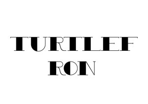
To get an idea of how my text would look at larger scales I produced this mock up poster based on a style that I felt suited the typeface particulalry well. To me it is quite apparent that the typeface design I have come up with so far has an almost Art Deco feel to it, reminiscent of the 1930’s. This has resulted in the selection of the image and tone for the poster. One thing that is quite clear from this design however, is the way letters like the x in the top line appear taller than the rest of the letters, this is due to the fact that the other letters have a barbed serif that slopes upwards to a point, creating an unrhythmic look to the line of text.

This is one of the early styles that I looked at, I wanted to start with my bold / headline face because I felt it would be easier to create a raw version that I could refine a text version from. This particular version shows how much I could push the contrats between thick and thin, I feel I have somewhat over sized the stroke in areas and it has lost the Italian aspect and isn’t as elegant as I would perhaps have liked.

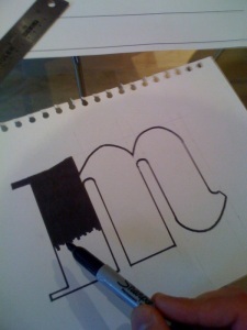
This was another early idea I was playiong around with, It was basically an experiment to see how much I could repeat from various letters to create new ones. One of the most Important things I have learnt so far about typeface design is to always ensure there is consitency in the style of every single letter and that one letter looking out of place is enough to throw the entire design off balance.

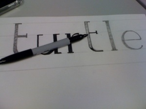
This image is an example of how much consideration has gone into each letter and how many versions I have been generating for each letterform. Admittidely some letters have recieved a bit more experimentation than others but I have learnt to rely more on my eyes in terms how things visually appear, rather than to measure everything as this often produces irrelgular looking letters that optically appear unrefined and unbalanced. The above example depicts some letters which appear more refined than others and are the designs I’ve chosen to progress further, The problem I have had in some cases however has been that a ceratin style may work well for one letter but not for an other, this results in individual letters looking complete and fully refined, but once put together the lack of consistency is instantly apparent.

This is the uppercase version of my typeface and ultimately I feel it already looks more refined than the lowercase version. the most difficult element I found with designing this part of the typeface was ensuring that uppercase and lowercase where explicitly part of the same family. Although neither case is anywhere near being completed, the following image depicts that they are clearly related and work together.

Again in this version the lack of rhythm is instantly apparent where irregular serifs break up the order of the sentence.

Once I had a basic style that I was content with I set about designing the text weight of my font. Having seen the results of relying too much on specific measurements on my bold face which resulted in some clumsy looking letters, I decided to tackle this version by refering more to “what looks right” rather than what logically seems right, this was advice I was often recieving from other typeface designers and my tutor. The results of the lowercase designs follow:

Straight away it is clear to see that this typeface is already more refined than the headline version; however, the essence of the original design is still there and my advice from here was to “cross – pollinate” the two styles, as there where aspects my peers liked from both styles.
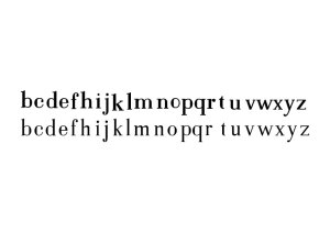
I haven’t completed the entire process yet as there are a few letters missing, but what I have done is make the bold face slightly less geometiric, with circular elements becoming more elipse shaped. I have also tried to work on the stroke in some places to create more regular looking letterforms. One thing that is clear to see is that the initial “cross polination” has been a success as it is apparent that these two designs are clearly related.

As I am fairly happy with the uppercase version of my bold face I decided to go ahead and design the uppercase set for my text weight, there are still a few letters that are incomplete and therefore have been omitted, but I thought it best to design the text uppercase first and then I could use the same “cross pollination” technique to refine the bold uppercase face.
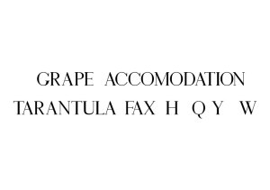
Initially I was very pleased with the early results of this design, I felt that I had captured the elegence of Itaian typeface design as well as increasing readibility, an aspect of English typefaces; however, when I began using upper and lower case together it was instantly clear that the capiutals where too lighweight and appeared to be of a completely different weight. The reason for this is because I slipped back into my habbit of measuring too much and went on the proportions of my lowercase design resulting on an almost ultra thin uppercase weight. I wasn’t too disheartened however, because I knew there was always the possibility of slimming down the lowercase text weight even more and creating a third typeface that was either a thin or ultra thin weight. This poses another issue however! If I do decide to create a thin version it is going to be useless at small scales as thin strokes will simply vanish upon printing, the result of this is that it will only be useful at large scales thus another headline weight which I have already designed. It’s not something I want to dismiss just yet as having two healine weights, one bold and one thin could still be practical as they each communicate different feelings.

The following images are a series of designs that have either been dismissed or where part of my design process and have evolved into the typefaces created so far.

Combining Italian and English Typefaces

March 19, 2010

Caslon and the English Font Scene

March 18, 2010

William Caslon was an English typeface designer practicing in the 1700’s he generated many serifed faces which where praised for their remarkable practicality. This makes the typeface Caslon, which was designed in recognition of William Caslon’s work an ideal starting point to look at for generating the English side of my typeface as I want the English aspect to be more prominent within the book or text face for my typeface family.

Ideally suited for text in sizes ranging from 6- to 14-point, Adobe Caslon Pro is the right choice for magazines, journals, book publishing, and corporate communications.

http://new.myfonts.com/fonts/adobe/caslon/

Another typeface which exhibits typical English qualities is Sally by Fontsmith which speaks for itself literally with the description used as the specimen sheet.

Both Caslon and Sally, as serifed faces work well at small point sizes with soft serifs allowing the eye to be drawn across the page at ease. The strokes are much more consistent in size contrary to the Italian faces that I have looked at, and exhibit a lot less rigidity in form.

Bodoni and the Italian Font Scene

March 18, 2010

Now that I have a concept to work from I now need some contextual research to go on. I know that I want to combine both Italian and English styles and create a typeface which merges the two looks. Traditionally the first famous typeface to spring top mind is Bodoni:

Working with this font requires care, as the strong emphasis of the vertical strokes and the marked contrast between the fine and thick lines lessens Bodoni’s legibility, and the font is therefore better in larger print with generous spacing.

http://new.myfonts.com/fonts/linotype/bodoni/

Bodoni was designed between 1909 and 1939 by Giambattista Bodoni and is characterised by it’s contrasting thick and thin strokes, as the description on myfonts states this stark contrast in strokes makes Bodoni more suitable as a display face. This is something that could be useful in emphasising particularly with my design making my display face more italian looking with subtle English influence and vice versa for my text face.

The Characteristics of Bodoni resonate in much of Italy’s contemporary typeface design, here are some examples;

FC United of Manchester, Newton Heath & Louis Rocca

March 18, 2010

Having established that my ‘lack of englishness’ concept was heading down a legibility dead end I decided to go back to the world of football and see if there is concept to be found which can actually produce a practical typeface. I chose to look at Manchester United, having already selected the team as inspiration for the foreign player concept I thought I may as well stick with just one team for now.

After some initial investigating from news reports and my own personal knowledge of the club, I developed some possible ideas for me to investigate. The first one came about from archived news stories that went back to the take over of the club by an American family named the Glazers. Many fans objected to the take over and turned their backs on the club resulting in the formation of a new club, FC United of Manchester.

So I probed a bit deeper into this line of enquiry and found out a little bit more about the club and found that despite being a fairly new club and residing in the lower tiers of the English Football League system, the club not only had national support but overseas as well. This seemed like an ideal opportunity for me to develop a conceptual typeface that was practical. My line of thinking was that maybe I could contact the club and work with them to produce a branding brief that would include a bespoke typeface that could work for the club on an international level. My reasoning for this is that much of my research has pointed to the fact that today, conceptual typography is generally used as part of a branding brief (for example, font smith’s champions league typeface).
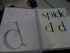
So I went about contacting the club to see whether I could work with them to create a brief from which I could work from but unfortunately after sending them an email explaining what it was I was trying to do, their response was that they were in fact working with numerous design companies already on a similar brief.

This wouldn’t have been too much of an issue as I could have simply generated the brief myself, but there was plenty of other alternatives I could have looked at so I chose to keep my options open.

Going back to the Glazer take over, there was more news reports to go on, most of which where more recent and involved United fans reverting back to the traditional club colours of yellow and green when the club was still named Newton Heath. I found this aspect of changing name and club colours quite insightful and potential for a new concept so I looked a bit more into the clubs past and found out some information on a man named Louis Rocca.

Louis Rocca was an Italian Immigrant who began working for Newton Heath FC as a tea boy, he worked for the club for almost 50 years covering various roles such as groundsman, kitman, talent scout and general fixer. he was responsible for acquiring the services of Sir Matt Busby as manager who went on to become the clubs most successful manager at the time. Rocca was also responsible for the name change when he first suggested the club should be named Manchester United. In general Rocca was known as bit of a utility man within the club and is regarded as the unsung hero in the clubs success all the way through the 20th century.

The fact that Rocca was an Italian immigrant who came to the UK in the Early 20th century resonates similarities to my own family history as I am a descendent from Angelo Guiseppe Decio, an Italian immigrant who arrived in Portsmouth just before world war 2 broke out.

These 2 aspects have given me a concept which I am now happy about and one that I believe can be both conceptual and legible. I want to take this aspect of 2 nations coming together as many Italians came to England during the early 20th century, this can be represented by combining two typical typographic styles, English and Italian. The concept will be to create a utility font in recognition of Louis Rocca, therefore I want to create two weights which will allow the font to be used as a headline font as well as for body text. This will therefore satisfy my brief criteria of creating a conceptual typeface which maintains practicality and legibility.

http://www.manutd.com/default.sps?pagegid=%7BB4CEE8FA-9A47-47BC-B069-3F7A2F35DB70%7D&newsid=150932&page=1

http://www.manchestereveningnews.co.uk/sport/football/manchester_united/s/150/150852_rileys_plan_to_honour_rocca.html

http://blog.studionorth.co.uk/tag/louis-rocca/

Lack of Engishness in English Football

March 18, 2010

As I have already stated, I began to create this typeface Grass Roots as a visual response to the fact that there is a lack of English talent coming up through football youth systems and too many English clubs buying players from abroad. The style of the typeface was deliberately meant to be slightly rudimentary and juvenile in appearance as it was representing unrefined players who are still quite young.

This has resulted in the letter forms being quite playful, and very soft in appearance, the x-height is quite big which has increased legibility and the serifs are in many places inconsistent which gives each letter an individual quirk to it; however, they still have enough consistent style to to become recognisable as part of the same font.

Now that I have a basic style for my typeface I have began to look at how I can refine it and improve my typeface design skills, particular letters deem to be slightly narrower or shorter than others, which is down to optical illusions generated by the shapes within certain letters.

This is demonstrated in this illustration from the book Lettering Design, By Michael Harvey, The Bodley Head Ltd, 1975, which states on page 31,

In a normal line of lettering the lack of horizontal strength in pointed and curved letters makes them appear too short.

This is clearly visible within my design, where I have gathered feedback that states that the ‘o’ actually appears thinner due to this phenomenon. To remedy this I returned to my initial Illustrator drawing and increased the weight of the letter so that it protruded beyond the x-height and baseline.

Small changes and details like this are essential to generating a well balanced typeface, and are remedies to many optical illusions which can occur when letter forms are poorly designed.

These are some detailed changes that my tutor and I have made to the typeface in order to improve it visually.

From this tutorial we also discussed how I could incorporate this idea of a lack of Englishness / Britishness in English football, so It was suggested that I look at different styles of typeface from around the world and see how I could perhaps incorporate other national styles into an otherwise English looking typeface.

To find some examples of international typeface designs, I took the current Manchester United football squad as an example. The club is represented by players from Brazil, France, Ireland, Portugal, Ecuador, Africa, Bulgaria, Italy, Serbia, Germany, Holland, South Korea, Poland and Norway. This drew up some major issues to consider when creating a typeface that is quintessentially English but has foreign influences upon it. For example, not only is there the issue of accents with european written language, there are also cyrillic letterforms to contend with and also far eastern letterforms which all need to be incorporated. If I was to create a typeface with all of these elements within then it would be a complete amalgamation of completely different shapes and styles which would make the typeface unrecognisable as English at all, which is in a way the issue I am trying to highlight, but the results would produce a typeface that is inconsistent in style, impractical and illegible which goes against everything I set out to do in this project in the first place.

Despite this, I took the typeface Caslon, which is recognised a traditionally English typeface, and edited aspects of the letterforms, with styles that I have found from other nations.

This is the result of the experiment, I chose to use an Italic version of Caslon as I thought that this would perhaps be the most suitable way of attempting to maintain a consistent style throughout the typeface, which in fact only exhibits characteristics of a select few styles that I have found. Represented are Serbia with the dissected a, d and o. Germany with mono stroke e and Ireland by the flamboyant flicks on the h, d and l.

Already though, the typeface looks unorganised and inconsistent which granted, could work as a potential concept and highlights the issue I am trying to portray, but doesn’t unleash any recognised attempt to achieve legibility and practicality.

Serbian Typeface Design

March 8, 2010

Sinisa Komlenic

Clutchee is an artsy display face by serbian designer Sinisa Komlenic, much of what I have seen from modern Serbian typeface design tends to be these very bold and contemporary  looking styles with the white space of each letter being made up of interesting disections into the letter forms.

Dimitar Vuksanov

This typeface by Dimitar Vuksanov, named Branko Kockica is another example of a heavy counterless display face. This tyepeface however does include cyrillic letterforms which is not always the case with some Serbian designs which tend to just stick to latin.

Branko Bobic

Branko Bobic has a very consistent style of typefaces to his name, all of which again display fat, counterless artsy characteristics. This is one example by the name of Aero Frog; again the letters are heavy, bold and utilise cutaway sections to create whitespace within the letterforms.